The TL;DR on this is always, always, always dig deep into any organization offering publishing services and do your due diligence. There are many ways to spend a lot of money and receive little value. Here’s the result of my digging into one of those services.
I’m part of several writers groups on a variety of social media sites. Earlier today, A fellow going by the name of “John Stokes” posted a link on one of these sites to waitlistr.com, saying something along the lines of “Apply to get on the waiting list for high quality Canadian book production services”. The image attached to the post referred to Agora Publishing.
A wait list? No reputable publisher I know of has a “wait list”, especially not one offering self-publishing support. They might have a slush pile, but not a wait list. This aroused my suspicions. It sounds like that well-worn marketing technique “false scarcity”. Better get on that wait list quick, or it will be years before they get to you! Right. Let’s check that out!
I left a comment saying that authors might want to check references before spending any time and/or money on this, and “John” deleted the post. Bad move, “John”. Now I’m curious!
First, as always, I check with Victoria Strauss’ Writer Beware blog at https://writerbeware.blog/ and https://writerbeware.com. There’s nothing there, but there was a Twitter post from her indicating that there have been complaints. You’ll have to find that yourself, since I’m no longer linking to sites that support fascism, and Strauss hasn’t made it to Mastodon yet.
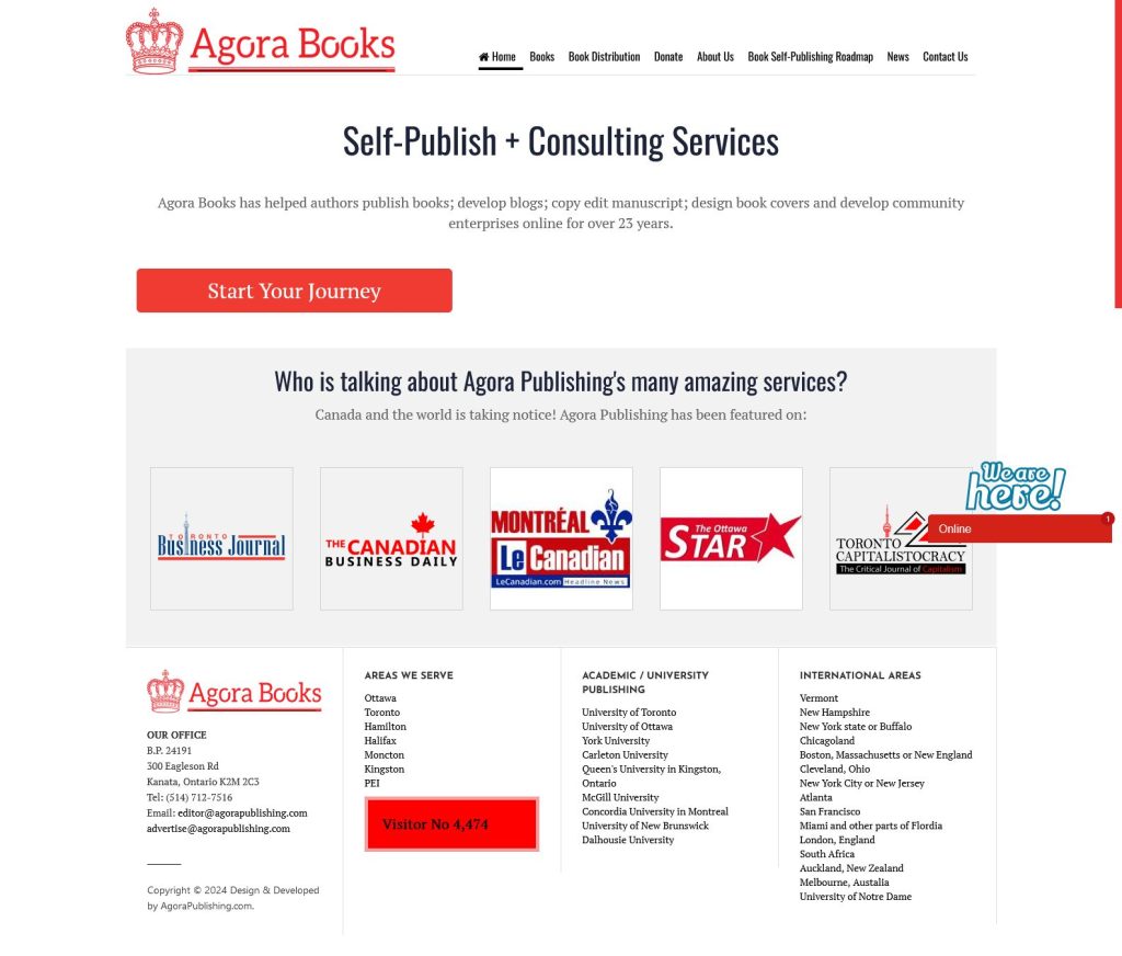
Next, I thought I’d look up Agora myself. What we get is a nice looking home page, but most of the links on that page just replicate the same information. There’s no evident content beyond that. Here’s what the home page looks like:
Looks okay, I guess. Save for the fact that the address is a PO box in a shopping mall and it’s an awfully thin site for 23 years of publishing. I figured I’d see where it’s hosted, so I did a quick IP address lookup and got 165.140.159.91, which appears to be a VPS at Scala Hosting. Noted.
Next, I wondered what all these sites that were “talking about Agora Publishing” actually had to say. None of the images actually link to websites, and I’d never heard of any of these publications, so that requires a little searching.
First up, the Toronto Business Journal found at tobj.ca, which we can find at (drum roll) 165.140.159.91:
There it is, in the footer: developed by agorapublishing.com. Well, that’s an independent, objective source, isn’t it? For an extra bonus check the sidebar which features some COVID-19 conspiracy theory garbage and (surprise, surprise) self-publishing services through Agora. There’s more cross-links there too if you want to really dig into the mind of this person.
On to the “Canadian Business Daily”. That site doesn’t come up, but there’s a YouTube channel of that name that links to agoracosmopolitan.com at, you guessed it, 165.140.159.91! Here we find… well it’s not a business journal, that’s for sure. All I can say is if I were an incel trolling for women to “neg”, I’d build a site that looked a lot like this one.
If you can stand to scroll down, you can find insightful business articles like “Are demonic clones now running the world?” Seriously.
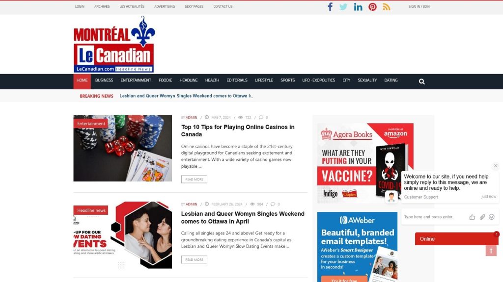
Moving on, we have “Le Canadian” https://www.lecanadian.com/ (yes, also at 165.140.159.91):
This is pretty much the same whacked out content as the other sites, still featuring dating events in the past. There’s no explicit mention of Agora, but the contact page lists “National Co-Managing Editor: John Stokes”. So, another independent journalistic source there. Is this starting to smell the same for you? I bet it is!
Next up we have “The Ottawa Star”, a non-responsive site, if I managed to find the right one. And finally, the glowing, independent review that would be found at “Toronto Capitalistocracy” [wut? LOL], if the site could ever be located. I found nothing referencing this ludicrously named site.
I was going to dig into “John Stokes” a little more, but I got blocked real quick. That’s great defence of my remarks there, bro. Nothing to hide, eh?
But there are ways around being blocked. I’m not planning to dig any deeper, but here’s the source for his profile image:
He’s cropped it, of course, but it’s good to know that “John” makes a good “Man in Blue Longs Sleeves Smiling at the Camera while Sitting on an Office Chair”. (Credit to Yan Krukau, who I imagine has never met the person behind the “John Stokes” name. https://www.pexels.com/photo/a-man-in-blue-longs-sleeves-smiling-at-the-camera-while-sitting-on-an-office-chair-7792769/). Needless to say, I won’t be convinced that a “John Stokes” exists until I see some official documentation.
Now, should you be masochistic enough to find some of the books available from Agora, be prepared for lots more conspiracy theory and the like. I’ll spare you what else I’ve learned.
It is probably redundant to say this, but if you’re looking for help self-publishing, Agora is not an option I’d recommend.
Update: A friend did a reverse lookup on the phone number and found Xcheaters-Reviews.com Magazine Publishing Montreal, QC. That site is dead now, but a LinkedIn page describes it as “Xcheaters-Reviews.com is an an eclectic lifestyles oriented magazine which includes investigative analysis and sightings reports on UFO and alien sightings.”, which sounds consistent with these other sites. Meanwhile there is an (also defunct) xcheaters-bistro.com, which was located at the same mall, same “BP” (which seems to be an attempt at “box postale”, or “bag postale”, except in French it’s CP “Case Postale”). Here’s a capture from the Facebook page:
Same phone number too! None of this seems to be based on the name xcheaters.com, which looks like a sleazy “casual dating” site based in Cyprus. I can’t see anything to say that they’re related, but opening a bistro based on the name of a sleazy dating site is curious, to say the least. Especially with all the dating-related content on those “business” sites. Possibly it’s just an outdated attempt to get some search traffic and route it through an affiliate link, or maybe it’s just deranged. It’s hard to tell.
Having just gone through some trouble trying to get a decent, fully responsive, non-trivial table working in Laravel Livewire, I figured I’d share. This code is available on GitHub as Laravel Livewire Paginated Table. Feel free to use and adapt.
First set up a project with breeze. I’m assuming you’re familiar with this process. If this is new, there are lots of other resources available to help. Replace “myproject” with your project name:
composer create-project laravel/laravel myproject
cd myproject
composer require laravel/breeze --dev
php artisan breeze:install livewire-functional
npm run dev
Next, we’ll create a table to hold the data and a factory to generate test data.
php artisan make:model -mc Part
php artisan make:factory PartFactory
In practice, the data in our table would probably be the result of a join and some computation but for the purposes of this example, I’m just going to mirror the columns in the table. Our migration for creating the parts table will look like this:
    public function up(): void
    {
        Schema::create('parts', function (Blueprint $table) {
            $table->id();
            $table->string('partNumber');
            $table->text('partDescription');
            $table->string('vendorNumber');
            $table->string('vendorName');
            $table->integer('orderQuantity');
            $table->integer('receiveQuantity');
            $table->decimal('cost');
            $table->decimal('extendedCost');
            $table->decimal('dutyPct');
            $table->decimal('duty');
            $table->decimal('freightPct');
            $table->decimal('freight');
            $table->string('uom');
            $table->string('vendorPart');
        });
    }
While we’re at it, set up the factory to generate sample data.
I tried to embed pagination inside a view-component and got nowhere. What worked for me was creating a component-component. In other words, I separated the component code from the view. While we’re here, I added some methods to populate and clear the table.
<?php

namespace App\Livewire;

use App\Models\Part;
use Livewire\Component;
use Livewire\WithPagination;

class PartList extends Component
{
    use WithPagination;

    public function populate(int $count)
    {
        Part::factory($count)->create();
        return redirect()->to('/');
    }

    public function purge()
    {
        Part::truncate();
        return redirect()->to('/');
    }

    public function render()
    {
        return view('livewire.parts.list', ['parts' => Part::orderBy('partNumber')->paginate(10)]);
    }
}
Making the CSS Mobile First
Nakayama’s CSS has a desktop first orientation. My first step was to reorganize it to be mobile-first, as a precursor to making it actually use Tailwind’s utility classes.
@tailwind base;
@tailwind components;
@tailwind utilities;

@layer components {
    /* Mobile first styles, extra small display, single column originally up to 580px */
    /* Now small display: up to 639px */
    ol.collection {
        margin: 0;
        padding: 0;
    }

    li {
        list-style: none;
    }

    ol.collection * {
        box-sizing: border-box;
    }

    .item {
        border: 1px solid gray;
        border-radius: 2px;
        padding: 10px;
    }

    /* Don't display the first item, since it is used to display the header for tabular layouts*/
    .collection-container > li:first-child {
        display: none;
    }

    .attribute::before {
        content: attr(data-name);
    }

    /* Attribute name for first column, and attribute value for second column. */
    .attribute {
        display: grid;
        grid-template-columns: minmax(9em, 30%) 1fr;
    }

    .collection-container {
        display: grid;
        grid-template-columns: 1fr;
        grid-gap: 20px;
    }

    @media (min-width: 640px) {
        /* Mobile first styles, small display, dual column originally 581px to 736px */
        /* Now medium 640px up to 767px */
        .collection-container {
            display: grid;
            grid-template-columns: 1fr 1fr;
            grid-gap: 20px;
        }

    }

    @media (min-width: 768px) {
        /* Mobile first styles, medium display, table originally 737px and up */
        /* Now 768 and up */

        .attribute::before {
            content: none;
        }

        /* Show the first item, since it is used to display the header for tabular layouts*/
        .collection-container > li:first-child {
            display: grid;
        }

        .item {
            border: none;
            padding: 0;
        }

        /* The maximum column width, that can wrap */
        .item-container {
            display: grid;
            grid-template-columns: 2em 2em 10fr 2fr 2fr 2fr 2fr 4em 6em;
        }

        .attribute-container {
            display: grid;
            grid-template-columns: repeat(auto-fit, minmax(var(--column-width-min), 1fr));
        }

        /* Definition of wrapping column width for attribute groups. */
        .part-information {
            --column-width-min: 10em;
        }

        .part-id {
            --column-width-min: 10em;
        }

        .vendor-information {
            --column-width-min: 8em;
        }

        .quantity {
            --column-width-min: 5em;
        }

        .cost {
            --column-width-min: 5em;
        }

        .duty {
            --column-width-min: 5em;
        }

        .freight {
            --column-width-min: 5em;
        }

        .collection {
            border-top: 1px solid gray;
            border-left: 1px solid gray;
        }

        /* In order to maximize row lines, only display one line for a cell */
        .attribute {
            border-right: 1px solid gray;
            border-bottom: 1px solid gray;
            display: block;
            grid-template-columns: none;
            padding: 2px;
            overflow: hidden;
            white-space: nowrap;
            text-overflow: ellipsis;
        }

        .collection-container > .item-container:first-child {
            background-color: blanchedalmond;
        }

        .item-container:hover {
            background-color: rgb(200, 227, 252);
        }

        .collection-container {
            grid-template-columns: none;
            grid-gap: 0;
        }

        /* Center header labels */
        .collection-container > .item-container:first-child .attribute {
            display: flex;
            align-items: center;
            justify-content: center;
            text-overflow: initial;
            overflow: auto;
            white-space: normal;
        }


    }
}
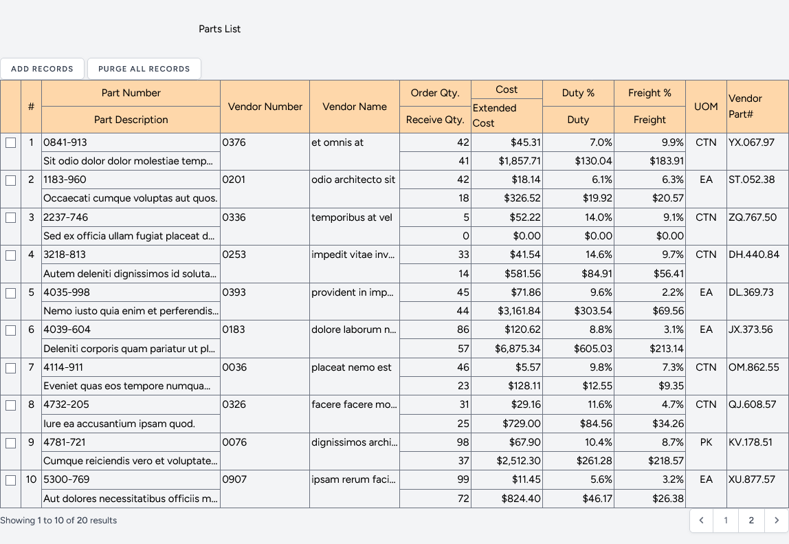
To test this, I copied the <section> from Nakayama’s HTML and dropped it into the view.
<section>
  <ol class="collection collection-container">
    <!-- Copied sample table data here -->
  </ol>
</section>
Time to add a couple of buttons to manage the table, loop through the data and add pagination.
<section>
    <x-secondary-button wire:click="populate(10)">Add records</x-secondary-button>
    <x-secondary-button wire:click="purge">Purge All Records</x-secondary-button>
    @if(count($parts))
        <ol class="collection collection-container">
            <!-- The first list item is the header of the table -->
            <li class="item item-container">
                <div class="attribute"></div>
                <div class="attribute" data-name="#">#</div>
                <!-- Enclose semantically similar attributes as a div hierarchy -->
                <div class="attribute-container part-information">
                    <div class="attribute-container part-id">
                        <div class="attribute" data-name="Part Number">Part Number</div>
                        <div class="attribute" data-name="Part Description">Part Description</div>
                    </div>
                    <div class="attribute-container vendor-information">
                        <div class="attribute">Vendor Number</div>
                        <div class="attribute">Vendor Name</div>
                    </div>
                </div>
                <div class="attribute-container quantity">
                    <div class="attribute">Order Qty.</div>
                    <div class="attribute">Receive Qty.</div>
                </div>
                <div class="attribute-container cost">
                    <div class="attribute">Cost</div>
                    <div class="attribute">Extended Cost</div>
                </div>
                <div class="attribute-container duty">
                    <div class="attribute">Duty %</div>
                    <div class="attribute">Duty</div>
                </div>
                <div class="attribute-container freight">
                    <div class="attribute">Freight %</div>
                    <div class="attribute">Freight</div>
                </div>
                <div class="attribute">UOM</div>
                <div class="attribute">Vendor Part Number</div>
            </li>
            <!-- The rest of the items in the list are the actual data -->
            @foreach ($parts as $part)
                <li class="item item-container" wire:key="{{ $part->id }}">
                    <div class="attribute" data-name="Select"><input type="checkbox" name="" id="{{ $part->id }}"></div>
                    <div class="attribute" data-name="#">{{ $loop->index + 1 }}</div>
                    <div class="attribute-container part-information">
                        <div class="attribute-container part-id">
                            <div class="attribute" data-name="Part Number">{{ $part->partNumber }}</div>
                            <div class="attribute" data-name="Part Description">{{ $part->partDescription }}</div>
                        </div>
                        <div class="attribute-container vendor-information">
                            <div class="attribute" data-name="Vendor Number">{{ $part->vendorNumber }}</div>
                            <div class="attribute" data-name="Vendor Name">{{ $part->vendorName }}</div>
                        </div>
                    </div>
                    <div class="attribute-container quantity">
                        <div class="attribute" data-name="Order Qty">{{ $part->orderQuantity }}</div>
                        <div class="attribute" data-name="Receive Qty">{{ $part->receiveQuantity }}</div>
                    </div>
                    <div class="attribute-container cost">
                        <div class="attribute" data-name="Cost">${{ number_format($part->cost, 2) }}</div>
                        <div class="attribute" data-name="Extended Cost">
                            ${{ number_format($part->extendedCost, 2) }}</div>
                    </div>
                    <div class="attribute-container duty">
                        <div class="attribute" data-name="Duty %">{{ number_format($part->dutyPct, 1) }}%</div>
                        <div class="attribute" data-name="Duty">${{ number_format($part->duty, 2) }}</div>
                    </div>
                    <div class="attribute-container freight">
                        <div class="attribute" data-name="Freight %">{{ number_format($part->freightPct, 1) }}%</div>
                        <div class="attribute" data-name="Freight">${{ number_format($part->freight, 2) }}</div>
                    </div>
                    <div class="attribute" data-name="UOM">{{ $part->uom }}</div>
                    <div class="attribute" data-name="Vendor Part Number">{{ $part->vendorPart }}</div>
                </li>
            @endforeach
        </ol>
    @else
        <p>There are no parts in the table.</p>
    @endif
    {{ $parts->links() }}
</section>
“Tailwindifying” the CSS
Right now we have a working solution, and we could call it done. But merely dumping our custom CSS into utilities isn’t exactly Tailwind native, and these styles also belong in the components layer, so let’s fix all that. Note that some of the colours changed slightly so we can use those provided by Tailwind. There are also a few tweaks for alignment, which will show up soon.
@tailwind base;
@tailwind components;
@tailwind utilities;

@layer components {
    /* Mobile first styles, extra small display, single column originally up to 580px */
    /* Now small display: up to 639px */
    ol.collection {
        @apply m-0 p-0;
    }

    li {
        @apply list-none;
    }

    ol.collection * {
        @apply box-border;
    }

    .item {
        @apply border border-gray-500 p-3 rounded-sm;
    }

    /* Don't display the first item, since it is used to display the header for tabular layouts*/
    .collection-container > li:first-child {
        @apply hidden;
    }

    .attribute::before {
        @apply content-[attr(data-name)] text-end pr-3;
    }

    /* Attribute name for first column, and attribute value for second column. */
    .attribute {
        @apply grid grid-cols-[minmax(9em,30%)_1fr];
    }

    .collection-container {
        @apply grid gap-5 grid-cols-1;
    }

    @media (min-width: 640px) {
        /* Mobile first styles, small display, dual column originally 581px to 736px */
        /* Now medium 640px up to 767px */
        .collection-container {
            @apply grid gap-5 grid-cols-2;
        }

    }

    @media (min-width: 768px) {
        /* Mobile first styles, medium display, table originally 737px and up */
        /* Now 768 and up */

        .attribute::before {
            @apply content-none;
        }

        /* Show the first item, since it is used to display the header for tabular layouts*/
        .collection-container > li:first-child {
            @apply grid;
        }

        .item {
            @apply border-0 p-0;
        }

        /* The maximum column width, that can wrap */
        .item-container {
            @apply grid grid-cols-[2em_2em_10fr_2fr_2fr_2fr_2fr_4em_6em];
        }

        .attribute-container {
            @apply grid grid-cols-[repeat(auto-fit,minmax(var(--column-width-min),1fr))];
        }

        /* Definition of wrapping column width for attribute groups. */
        .part-information {
            --column-width-min: 10em;
        }

        .part-id {
            --column-width-min: 10em;
        }

        .vendor-information {
            --column-width-min: 8em;
        }

        .quantity {
            --column-width-min: 5em;
        }

        .cost {
            --column-width-min: 5em;
        }

        .duty {
            --column-width-min: 5em;
        }

        .freight {
            --column-width-min: 5em;
        }

        .collection {
            @apply border-t border-l border-gray-500;
        }

        /* In order to maximize row lines, only display one line for a cell */
        .attribute {
            @apply block border-r border-b border-gray-500 grid-cols-none overflow-hidden p-0.5 text-ellipsis whitespace-nowrap;

        }

        .collection-container > .item-container:first-child {
            @apply bg-orange-200;
        }

        .item-container:hover {
            @apply bg-blue-100;
        }

        .collection-container {
            @apply grid-cols-none gap-0;
        }

        /* Center header labels */
        .collection-container > .item-container:first-child .attribute {
            @apply flex items-center justify-center overflow-auto whitespace-normal;
            text-overflow: initial;
        }
    }
}
While we’re at it, let’s make the card view a little nicer and align the columns in the table view:
There’s more that could be done here. For example, some of these constructs could be generalized to make it easier to support multiple tables. If your application has a lot of different tables, that would be the best approach.
This is a discipline that I’ve only recently started to adopt. I really wish I’d come up with it earlier.
I have been in the habit of leaving a project out until I finish it, in no small part because if it’s put away I fear it will just disappear and never get done. The problem here is that being ADD, another project comes along and the first project gets deferred indefinitely. Then another project defers the second, then… then there’s a great pile of unfinished projects and the one you suddenly actually need to finish is somewhere in the middle of all that and your workspace is a disaster area. More than likely all your workspaces have merged into a huge, oppressive, unmanageable, crushing mess.
Now I try to put unfinished projects away as soon as I stop working on them, even if my best intention is to pick up where I left off the next day. In no small part, this has been enabled by my clear bin storage system, which prevents a project in storage from seemingly ceasing to exist because it’s no longer visible. Sometimes I’ll put the project into a clear container but leave the container on my workbench, so if I do start on it the next day, it’s right there. When the Next Thing else comes up, I can take that project container, drop a label on it with painter’s tape, and put it on a shelf. It’s organized; everything I need for the project is there in one place.
Part of my brain still rebels. The ADD me (who still thinks he can get everything done at superhuman speed) says “No way, we will get this done tomorrow! Really! Just leave it! Why are you wasting 10 precious minutes on this?” But the older, wiser me knows that the time/effort of putting it away and bringing it back out is far less than the stress of dealing with the mess when it doesn’t get finished the next day.
One of the problems with being ADD is the “If you can’t see it, it ceases to exist” phenomenon. For me, this is one reason why my desk is stacked high with piles of stuff and projects are scattered across every flat surface in my space. The mess can be oppressive, but it winds up being preferable to a void feeling I get, a sense of emptiness when everything is neatly organized and put away and out of sight. If that statement sounds completely weird to you, then you probably don’t experience ADD the way I do and the rest of this article will make no sense either.
But there comes a breaking point, where the sheer weight of the mess makes a space unworkable. The usual fix to this is to get a big box, shove all the crap projects into it and then weeks or months later wonder where “that thing I had on my desk” went, followed by the dreaded rummaging through the box(es) of stuff that used to on the desk.
I’m focusing on my desk here, but this problem isn’t just confined to desks, it’s all-encompassing. Papers, clothes, tools, cleaning supplies, stuff. I can usually spot an ADD family two seconds after entering their personal space.
There’s an organizational sweet spot, somewhere between “this place is unworkable” and “a clear desk is the sign of an empty mind”, and I’ve developed a system for getting (and staying) closer to it. My Clear Bin Granular Organizing System is based around a set of clear bins in multiple sizes, starting with “huge” (with a volume of 40 litres) all the way down to tiny, at a volume of 100 ml. Most of these I get from IKEA (at least down to the 5 l size, from there it’s more haphazard).
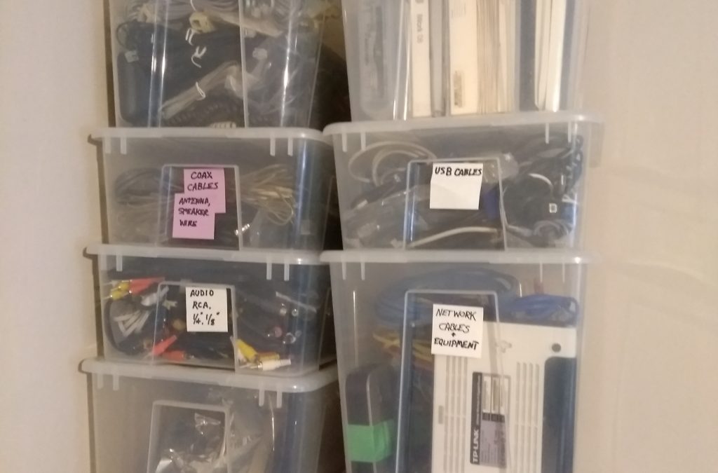
A problem I had was a tendency to be either disorganized or (attempt to) be hyper-organized. Naturally the hyper-organized attempts failed because something more interesting always comes up before the process is complete. One day, facing a “dump it into a box and start over” crisis, it dawned on me that just a little sorting during the purge could help immensely, so I got two large clear boxes and a couple of smaller ones. Things related to an identifiable project went into their own box. Into one large box I put “papers” (including unread books, newspapers, etc.); into the other “Electricity and electronics”. Now I had a clear desk, half a dozen boxes, was marginally more organized, and if I wanted to be done with it and move to the next thing, it was obviously already better than the one big mystery box.
Then I took that electricity and electronics box and went around the house, collecting all the stray stuff in that category. It wasn’t long before the box was overflowing, and that’s my Eureka moment. The box contained power cords, power bars, chargers, cables, calculators, a tablet, bits of computer hardware, lights… I broke it down into a large box for power bars and electrical cords, a smaller box for cables, and a smaller box for the tablet, calculators, and tools. Anything not in those categories stayed in the big box. Then I went back to the cable box and broke it down into smaller boxes: one for Ethernet, one for USB, one for everything else.
And then that’s when it became a system! I returned to the big box of papers and sorted them into stuff that needed to be filed, stuff to trash (still a bin, but not clear), things to read, and things that should be acted upon.
There it was, all the stuff on my desk (and more), no longer on my desk, but also both visible and much more organized than ever before. No Big Box of Doom, either!
Here’s the system in a nutshell:
Assessment: look for natural divisions in the stuff that needs to be organized. The key here is that the divisions can be huge, like paper or not paper; or small like a pile of business cards to sort through.
Get the smallest possible box that will contain each of the divisions of stuff. Use Painter’s tape to label each box with the intended contents. The advantage of painter’s tape is as you reassign boxes, you just peel it off and write out a new label. [This can also avoid the rabbit hole of spending a day deciding on how to create the Best Labels Ever.]
Put the stuff into the assigned boxes. Resist the urge to sort each category, just get it done!
You can stop right now, knowing that you’re already better off than tossing everything into a box and sticking it into a corner. That’s the key point of this system: it can be “perfect” but it doesn’t have to be. It’s a tool for incremental improvement. Best of all, you never have to start over. Now can carry the system into other parts of your space. As you go, follow these steps.
If a box overflows, assess the box for sub-categories. If they exist, break the stuff into multiple boxes, updating the labels if required. One of mine was “Hooks, pads, adhesives” that first got the adhesive part broken out, then adhesives wound up splitting into one for tape and one for glues.
If you discover that you have two boxes with the same label, merge them or sort them into sub-categories.
If a box winds up mostly empty, downsize it.
Best of all, because the boxes are clear, none of it ceases to exist. It’s all there, visible but with at least a minimal level of organization.
This system isn’t going to solve every problem. I’m not trying to pretend to be Marie Kondo here. I still have an ongoing battle with OFSD, but at the same time I can find a LOT of stuff that I couldn’t find before, and I haven’t thrown everything into a Box of Doom for almost a decade, either.
A Boeing 747 cockpit, a functional complex interface
Note: This was originally published on a Joomla blog in 2013. The details are outdated, but the principles remain the same.
User Experience (UX) design is an important aspect of almost every software application. Most users benefit from having a simple, easy to understand interface that offers intuitive choices to achieve their goals. Advocates of the simple approach point to surveys that measure how users respond to the design of an application, where simpler interfaces almost always garner a better rating.
The challenge is that not all applications can be reduced to a simple model. The current trend in UX design is to break a complex task down into a set of smaller, simpler interfaces, and then give the user a method of selecting or stepping through each of these interfaces. In some cases where a lot of this input is required, the user is guided through a sequence of simple steps to achieve a complex goal. This doesn’t work. It’s the opposite of the one-step checkout process that works so well for commerce sites, and we need a better solution.
This simplification and the drive for a “clean” user interface has become even more pervasive with the rise of mobile devices. User interfaces are dropping mouse-related functionality and adapting to smaller screen sizes.
While all of this is generally good and something I support, I think we’re losing something important. When we build a single interface designed for the broadest range of users, we leave other users out. The distribution of user requirements isn’t even. Every user base breaks down into clusters based on skills, needs, abilities, and equipment. Every time you tune your UX for one cluster, you run the risk of making it less useful for another cluster.
As a case in point, let’s take the administrator interface for Joomla 3.0. This interface is based on Twitter Bootstrap, which makes it responsive and touch friendly, which is a good thing. But let’s look at it from the perspective of a content creator/manager. After all it’s a CMS:
Menu navigation: In Joomla 2.5, when you hover a mouse cursor over a top level menu item, the submenu automatically appears. In Joomla 3.0, “mouse hover” is not a touch interface concept, so nothing happens. Desktop users just have to click, click, click. While the majority of new devices sold are mobile and touch, I think it’s safe to assume that most web sites will be administered from desktops for some time to come. This is not an improvement.
Article Manager: It’s clean, it’s pretty, it’s missing information. Want to find out how many hits an article has? Edit the article, then go find the right tab. Want to sort by hits to see what content is most popular? Go fish. Sure the control panel has a nice display of most popular articles, complete with a colour scheme that’s supposed to mean something intuitive, but if you want to filter by category you’ll have to find an extension for that.
Article Creation/Editing: Let’s look at the evolution from Joomla 1.5. Joomla 2.5 linearizes the title / category / publishing status fields. While this is useful for tab order (what, users with keyboards?) it creates a pile of white space that crushes the area available for the article. Various other details are retained in the accordion style tabs on the right. While I’m on the accordion tabs, the fact that you can’t open more than one tab at a time still irks me – why can’t I see the author name and the metadata at the same time? Meanwhile in Joomla 3.0 we have the title and category selection above the editor, a much wider edit screen, publishing details in a narrower right column, and image details below the editor. Everything else is now in tabs. Click a tab, the editor is replaced with the fields on the tab. While this is probably great if you’ve got a hobby blog, it’s got a lot of other issues. For me the most significant is that you can no longer see the article when entering the meta description. If you want to get it right, you wind up tabbing back and forth, cobbling it together a few words at a time. Visual simplicity is not user simplicity.
I hope these examples illustrate the point. What works best for the biggest cluster of users probably doesn’t work best for other clusters. It’s common to hear that one of the reasons WordPress is more popular than Joomla is because it has a simpler user interface. So we simplify the Joomla interface to address this, and not only do we have a pile of tabs that will still have users calling it too complex, we make it more difficult for content creators who know what they’re doing. It’s a lose-lose scenario. It’s also not particularly informed by looking at WordPress closely. With a SEO plugin installed, the WP post creation page has all the relevant information displayed at once. No accordion, no tabs. Lots of information in your face at the same time. Where WP has the advantage is that if you don’t care about SEO, it’s just not there. The interface gets more complicated as user requirements get more complex. It’s this scaled functional complexity that’s the key to the positive impression, not some UX magic.
Joomla should be offering configurable interfaces targeted at each user group, so that those of us who run with a huge desktop screen can see everything we need at once – just like the cockpit of a jet aircraft – and at the same time someone with less complicated requirements can have the iPod interface.
Image credit: SWF Photography used under a CC-BY-SA License.


Recent Comments