An Argument for Complex User Interfaces
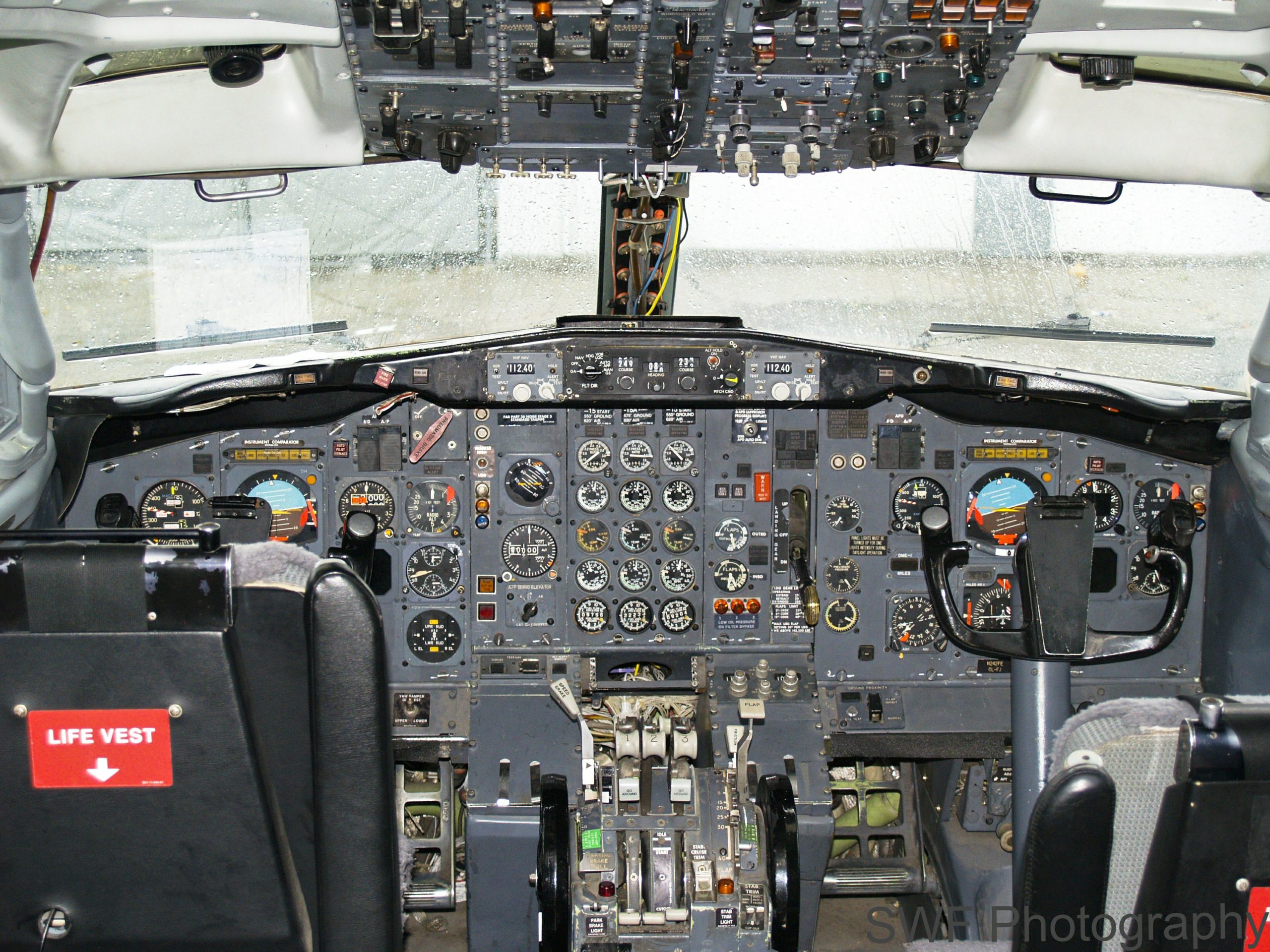
A Boeing 747 cockpit, a functional complex interface
Note: This was originally published on a Joomla blog in 2013. The details are outdated, but the principles remain the same.
User Experience (UX) design is an important aspect of almost every software application. Most users benefit from having a simple, easy to understand interface that offers intuitive choices to achieve their goals. Advocates of the simple approach point to surveys that measure how users respond to the design of an application, where simpler interfaces almost always garner a better rating.
The challenge is that not all applications can be reduced to a simple model. The current trend in UX design is to break a complex task down into a set of smaller, simpler interfaces, and then give the user a method of selecting or stepping through each of these interfaces. In some cases where a lot of this input is required, the user is guided through a sequence of simple steps to achieve a complex goal. This doesn’t work. It’s the opposite of the one-step checkout process that works so well for commerce sites, and we need a better solution.
This simplification and the drive for a “clean” user interface has become even more pervasive with the rise of mobile devices. User interfaces are dropping mouse-related functionality and adapting to smaller screen sizes.
While all of this is generally good and something I support, I think we’re losing something important. When we build a single interface designed for the broadest range of users, we leave other users out. The distribution of user requirements isn’t even. Every user base breaks down into clusters based on skills, needs, abilities, and equipment. Every time you tune your UX for one cluster, you run the risk of making it less useful for another cluster.
As a case in point, let’s take the administrator interface for Joomla 3.0. This interface is based on Twitter Bootstrap, which makes it responsive and touch friendly, which is a good thing. But let’s look at it from the perspective of a content creator/manager. After all it’s a CMS:
Menu navigation: In Joomla 2.5, when you hover a mouse cursor over a top level menu item, the submenu automatically appears. In Joomla 3.0, “mouse hover” is not a touch interface concept, so nothing happens. Desktop users just have to click, click, click. While the majority of new devices sold are mobile and touch, I think it’s safe to assume that most web sites will be administered from desktops for some time to come. This is not an improvement.
Article Manager: It’s clean, it’s pretty, it’s missing information. Want to find out how many hits an article has? Edit the article, then go find the right tab. Want to sort by hits to see what content is most popular? Go fish. Sure the control panel has a nice display of most popular articles, complete with a colour scheme that’s supposed to mean something intuitive, but if you want to filter by category you’ll have to find an extension for that.
Article Creation/Editing: Let’s look at the evolution from Joomla 1.5. Joomla 2.5 linearizes the title / category / publishing status fields. While this is useful for tab order (what, users with keyboards?) it creates a pile of white space that crushes the area available for the article. Various other details are retained in the accordion style tabs on the right. While I’m on the accordion tabs, the fact that you can’t open more than one tab at a time still irks me – why can’t I see the author name and the metadata at the same time? Meanwhile in Joomla 3.0 we have the title and category selection above the editor, a much wider edit screen, publishing details in a narrower right column, and image details below the editor. Everything else is now in tabs. Click a tab, the editor is replaced with the fields on the tab. While this is probably great if you’ve got a hobby blog, it’s got a lot of other issues. For me the most significant is that you can no longer see the article when entering the meta description. If you want to get it right, you wind up tabbing back and forth, cobbling it together a few words at a time. Visual simplicity is not user simplicity.
I hope these examples illustrate the point. What works best for the biggest cluster of users probably doesn’t work best for other clusters. It’s common to hear that one of the reasons WordPress is more popular than Joomla is because it has a simpler user interface. So we simplify the Joomla interface to address this, and not only do we have a pile of tabs that will still have users calling it too complex, we make it more difficult for content creators who know what they’re doing. It’s a lose-lose scenario. It’s also not particularly informed by looking at WordPress closely. With a SEO plugin installed, the WP post creation page has all the relevant information displayed at once. No accordion, no tabs. Lots of information in your face at the same time. Where WP has the advantage is that if you don’t care about SEO, it’s just not there. The interface gets more complicated as user requirements get more complex. It’s this scaled functional complexity that’s the key to the positive impression, not some UX magic.
Joomla should be offering configurable interfaces targeted at each user group, so that those of us who run with a huge desktop screen can see everything we need at once – just like the cockpit of a jet aircraft – and at the same time someone with less complicated requirements can have the iPod interface.
Image credit: SWF Photography used under a CC-BY-SA License.
Recent Comments